Acquisitions Call Center
- Web Application -
Redefining the Call Center Experience
__________
Acquisitions Call Center
01. The Challenge
Design a new, easy-to-use intuitive user interface to enable Acquisitions Customer Care Associates or Agents to effectively handle inquiries from prospective customers.
This initiative needed to support multiple brands and sustain a more targeted selling strategy by providing a more individualized experience by leveraging customer data.
02. The Outcome
The successful delivery of the largest digital design solution with the highest SUS score achieved by the design and research team.
Client
Fortune 500 Energy Company
Platform
Web Application - SAP Fiori
Year
2016-2017
Research
Know The Agent
During the discovery phase our team observed 22 Agents (8 rookies and 14 experts) assist customers across 66 calls. With each Agent using the current system in different ways, our team gathered crucial data pertaining to how the agents are trained, what parts of the current system were most difficult to learn and master, what common themes occurred, what pain points persisted, and what agents wanted from a new system.

Architecture
Defining the System
It quickly became evident that the current system was not linear and lacked the consistency required for Agents to do their jobs efficiently. We found that Agents first needed a system that provided feedback, that had a clear task flow, and the ability to save their place in the process.

Foundation
We began to dive into the data from the discovery phase and prioritized pain points. In our research we had discovered that external tools were also being utilized by the Agents; these tools needed to be built into one cohesive system to reduce multitasking, cut down on clicks needed and average handling time, and increase flexibility.
The foundation started to take form as important call tasks were organized by the order in which Agents were trained to address them during calls.

Creating a Flow
Enforcing the business process through a linear UI aimed to reinforce the education of rookie agents and reduce their training time. The challenge became addressing at what point data was required by the Agents to complete the task at hand.
Capturing the Details
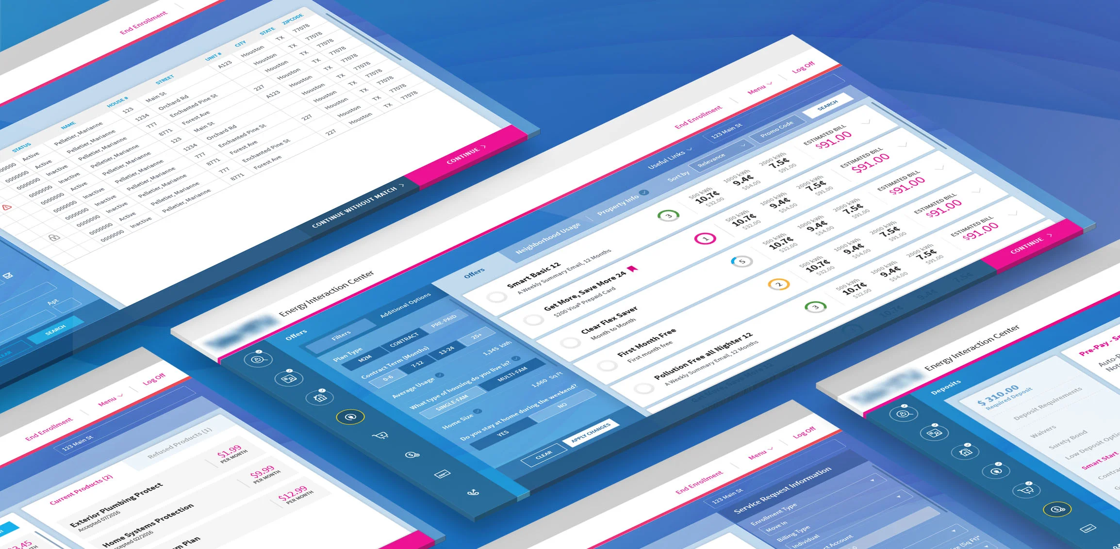
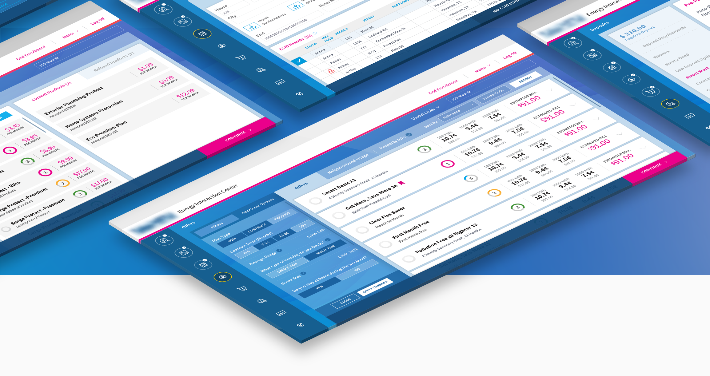
After the necessary flows were established, the task of making sure the data pertinent to each step was included began. Of the four major flow types (TOS, MVI, SWI, and MVO) each required different steps and completed form fields to complete the transaction.

Design
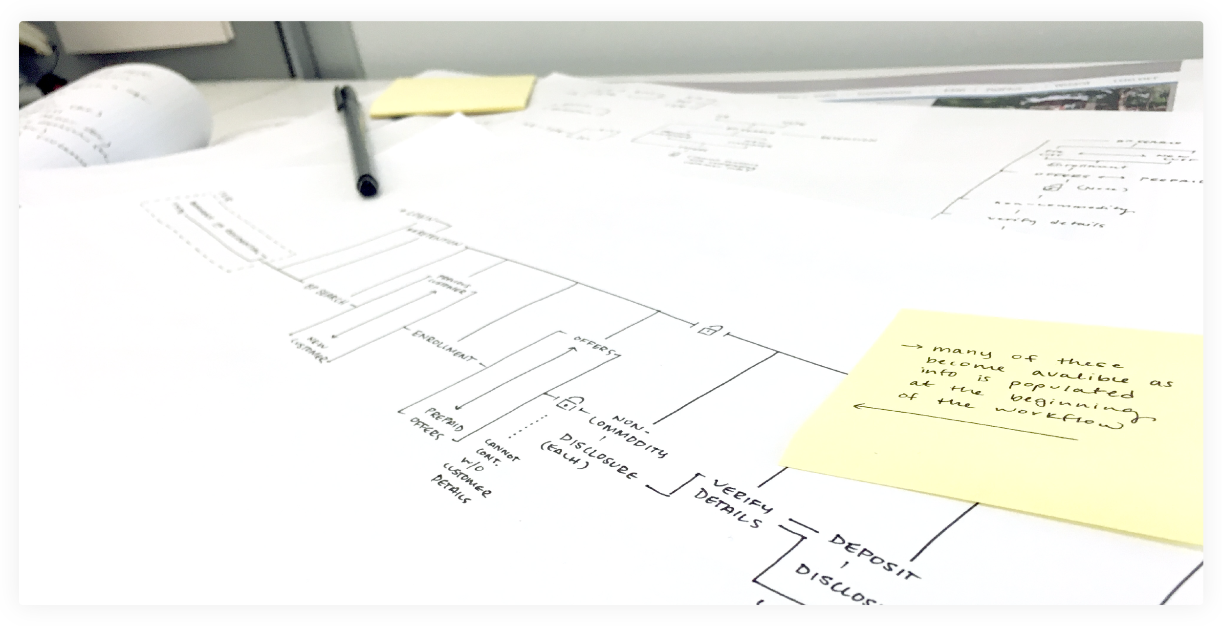
Wireframing
After updating the architectural structure of the software it became clear that the pages within the UI had an important hierarchy. Working with Agents, we began to build wireframes that allowed for crucial collaboration and provide feedback on where the inputs and data needed to live.


Navigation
The process of sketching and ideating on screens and navigation took place before working through the computer. Research and design fell into a rhythm of collaboration via whiteboard and sketch before screens even began to take form. This helped increase efficiencies during the design review process.

Designing to Inform
Through over 1,000 finalized wireframes, a design system for three brands emerged. The solution needed to not only teach but also inform an entire new way of streamlining calls from customers. Each form field, data placement, and pop-up had to be properly positioned in order to make resolving customer calls effortless.
DESIGN
Visual Design
When moving into visual design a couple challenges became apparent: How would we be able to maintain the needs of a simplistic form, alleviate eye strain, and present a delightful visual experience?


Complementing a Vibrant Brand
During the visual design phase we challenged ourselves on how we might use color in order to help the Agents quickly focus on the task at hand. With the brands’ predominantly cool color palettes, warmer colors acted as a visual anchor to locate important data points and CTAs within the system.
To be able to distinguish between the various steps and the Agents’ current step in the process, we created an iconographic system to illustrate status via the left hand navigation panel.
“I am still confused about the current system we are actually using at work and I feel like I already understand this one.”
03. The skills used
User Observation, User Interviews, Requirements workshops, Design Thinking Workshops, Information Architecture, Interaction Design, Prototyping, Usability Testing, Visual Design, Specs Documentation
Credits
Primary Designer:
Hailey Farris
Design Support:
Lali Lobzhanidze
Xun Meng
Joie Chung
Jorge Robles
Research:
Elizabeth Brand
Adrian Garcia